
from problem hands, to lifestyle brand
It was time for Carex to shake up what had become a functional and emotionless category, and to fight back against the tide of me-too brands that had entered the market, emulating its proposition and eroding market share.
- Client / Carex
- Work / Brand / Packaging
- Year / 2019
“We wanted Carex’s leadership in the category to be reflected by a significant step forward in look and function. The new structure is more impactful on shelf, easier to use and better to store on the go. The updated graphics strengthen Carex’s branding and clearly communicate the brand’s benefits. PB has delivered a consumer-focused design that exactly meets the challenge we set and the trade and consumer response has been amazing.”
Ian Henderson, Carex Global Head of Brand
reasserting category leadership
PB Creative was tasked with re-instating the brand as market leader by developing a holistic brand and packaging proposition with a new and unique structure and 2D brand identity that balances care with efficacy and delivers superior distinction on shelf versus the previous design.
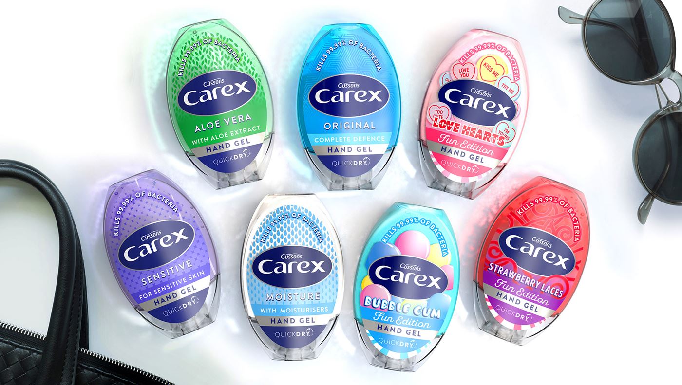
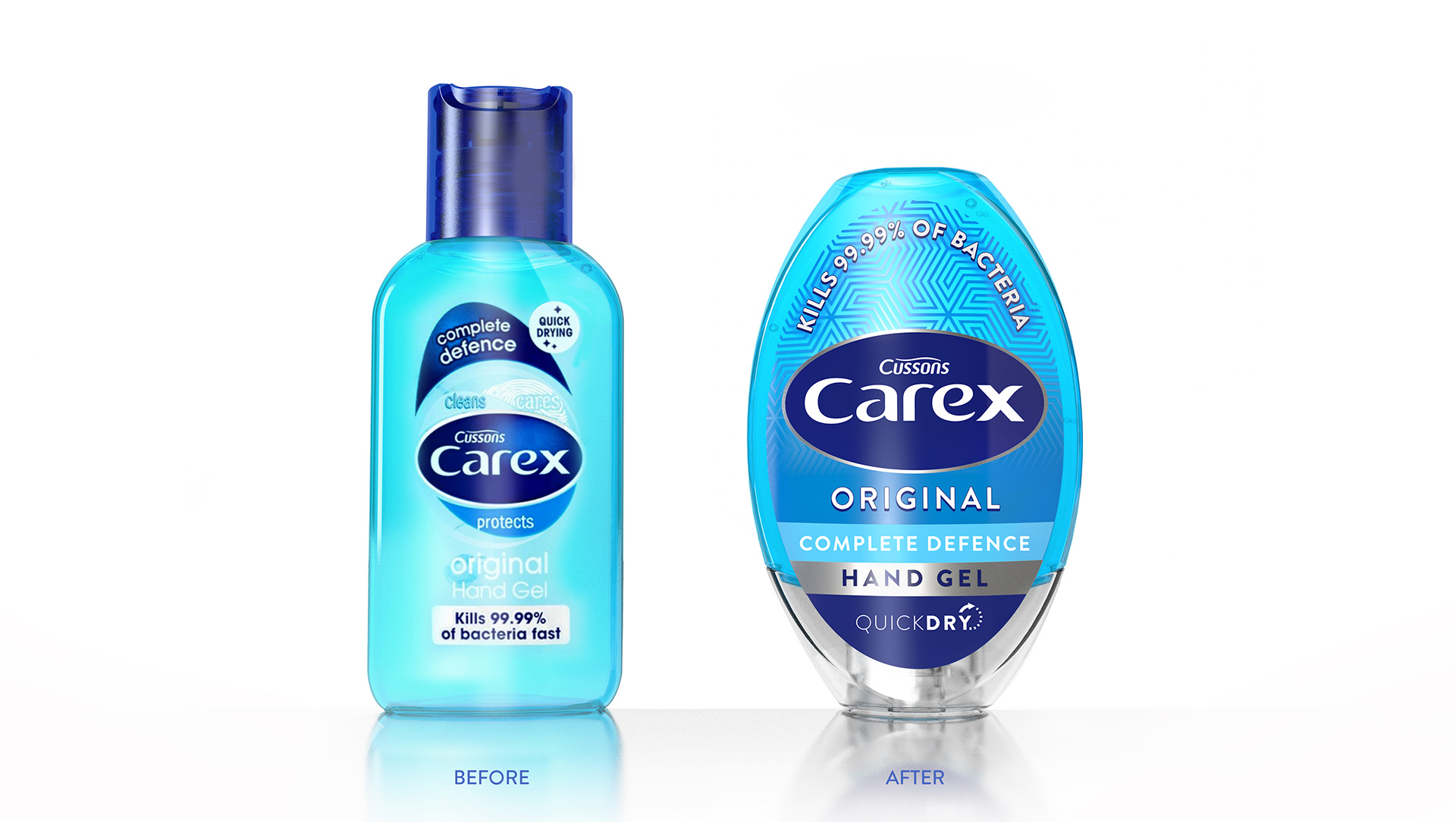
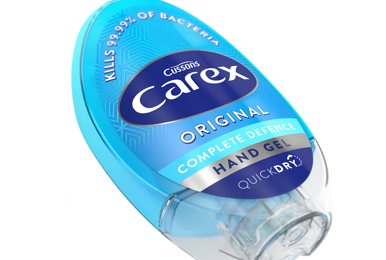
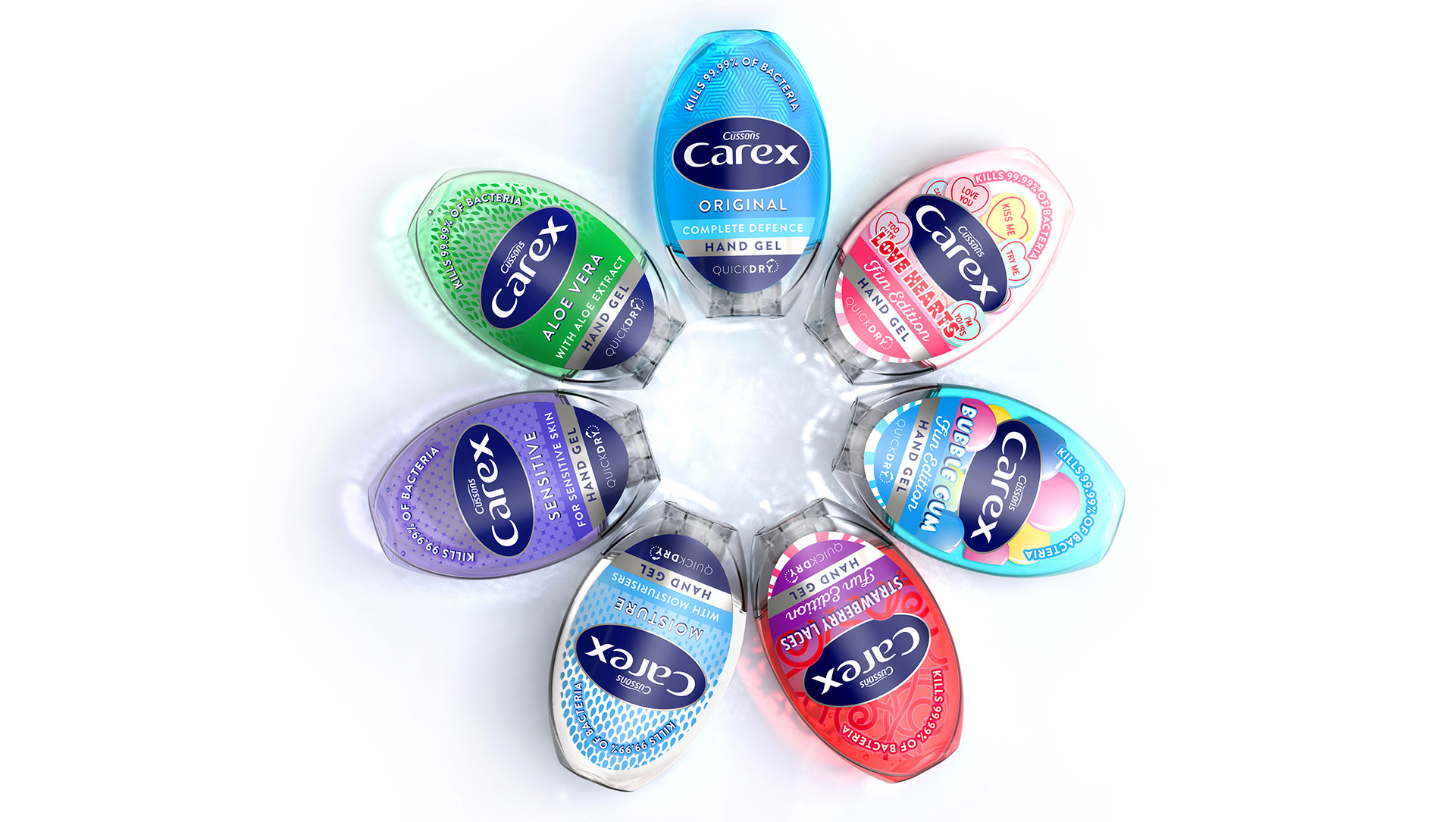
The structures oval, pebble like form is inspired by the Carex brandmark, delivering covetable and ultimately branded distinction. The integrated closure seamlessly completes the new elliptical silhouette to leverage character and personality on shelf. The new structure’s functionality has also been enhanced by simply inverting the pack to a top down orientation that makes product delivery easier in one swift motion and leverages further advantage over the brands competitors.

genuine consumer appeal
While the pack volume has remained the same, the branding area by is 50% bigger thanks to an innovative approach which extends the label-able surface from the bottle onto the closure. This allows the brand mark to sit prominently at the heart of the pack and delivers consistency across the extended range.
The new visual identity centres around the brand mark which has been crafted, modernised and simplified. The updated communication hierarchy is clear yet beautifully executed, a significant move on from the previously cluttered and confused design. Variant differentiation is delivered through the bold colour coding of the liquid, backed up by distinctive illustrative patterns that link to the efficacy and proposition of the different formulations. When holistically combined with the modern and engaging structure, we create a compelling, distinctive and ultimately branded solution.
Covetable
Covetable
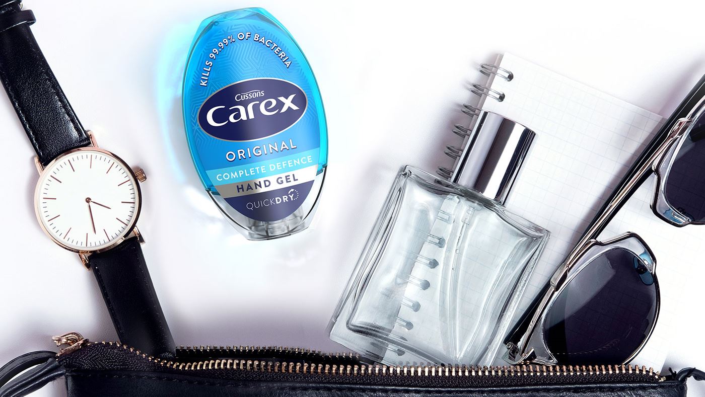
We’ve cemented Carex’s position as the premier hand sanitiser in the category by setting it apart from its commoditised competitors and substantially improving it’s look, feel and functionality to achieve an almost jewel-like ‘covetability’ and handbag friendliness as opposed to the ‘problem hands’ persona of its peers.
Sales uplift
Where sales had been in decline by -4%, our redesign prompted an uplift in sales of 96% in the first three months of launch (before the Covid-19 pandemic). Many new distribution channels have been opened up and the range has been extended across Fun Edition packs where the Carex brand personality has been dialled up using playful imagery and typography making hygiene fun for sticky little fingers.
Carex hand gel
awards & recognition
| Total | Awarding Body | Award Name |
|---|---|---|
|
1
|
Transform Awards 2020 | Bronze Best Use of Packaging |