
modernising a dutch classic
Renowned for its orange identity and 150 year Dutch heritage, Honig is the most trusted and best loved food brand in The Netherlands. Yet with consumer behaviour changing, our new redesign has revived and elevated the overall brand perception to align with the latest food trends.
- Client / Honig
- Work / Visual identity
- Year / 2021
“PB’s redesign of Honig has allowed us to adapt to the changing needs and desires of our evolving audiences and constantly changing food trends without alienating existing consumers and while staying accessible to everyone. We now have a distinctive and ownable master brand visual identity which has injected personality back into the Honig range and enabled us to become relevant to today’s consumers once again."
Tanja Kempen, Marketing Manager - Kraft Heinz
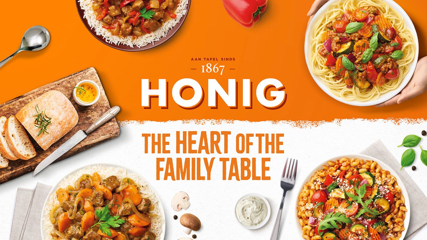
To the Dutch, Honig is like a member of the family, the everyday culinary hero that helps consumers make something complicated, easy. But with declining consumer engagement and nostalgic associations evoking memories of childhood family mealtimes, we were briefed by Kraft Heinz to create a distinctive and contemporary new visual brand identity, packed with taste appeal and targeting the next generation of Honig consumers.
Renowned for its orange identity and 150 year Dutch heritage, Honig is the most trusted and best loved food brand in The Netherlands. Yet with consumer behaviour changing and more in-home meals being made from scratch, the category is evolving with fresh, new and exciting brands. Our new redesign has revived and elevated the overall brand perception to align with the latest consumer trends.
blocking
blocking
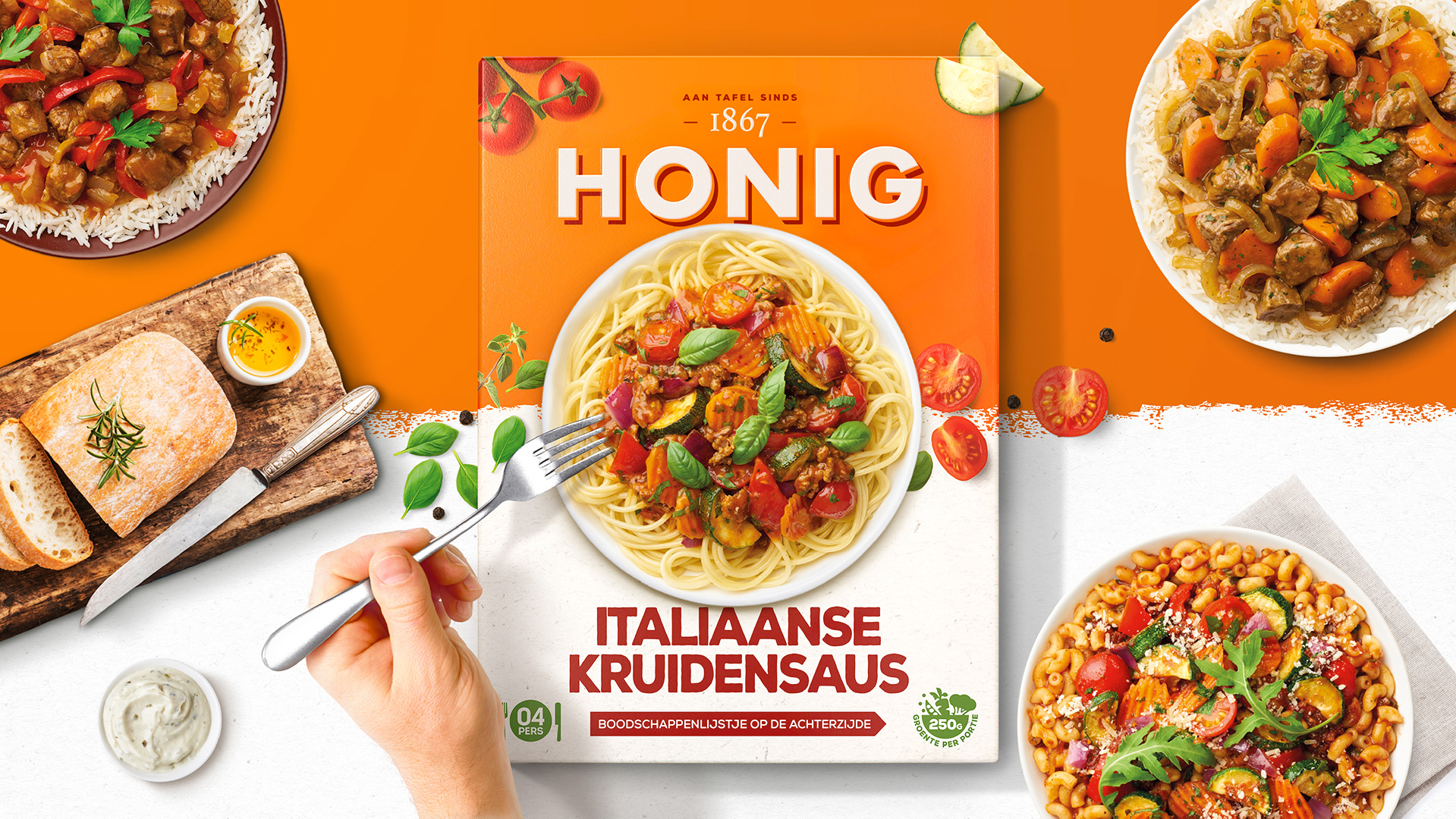
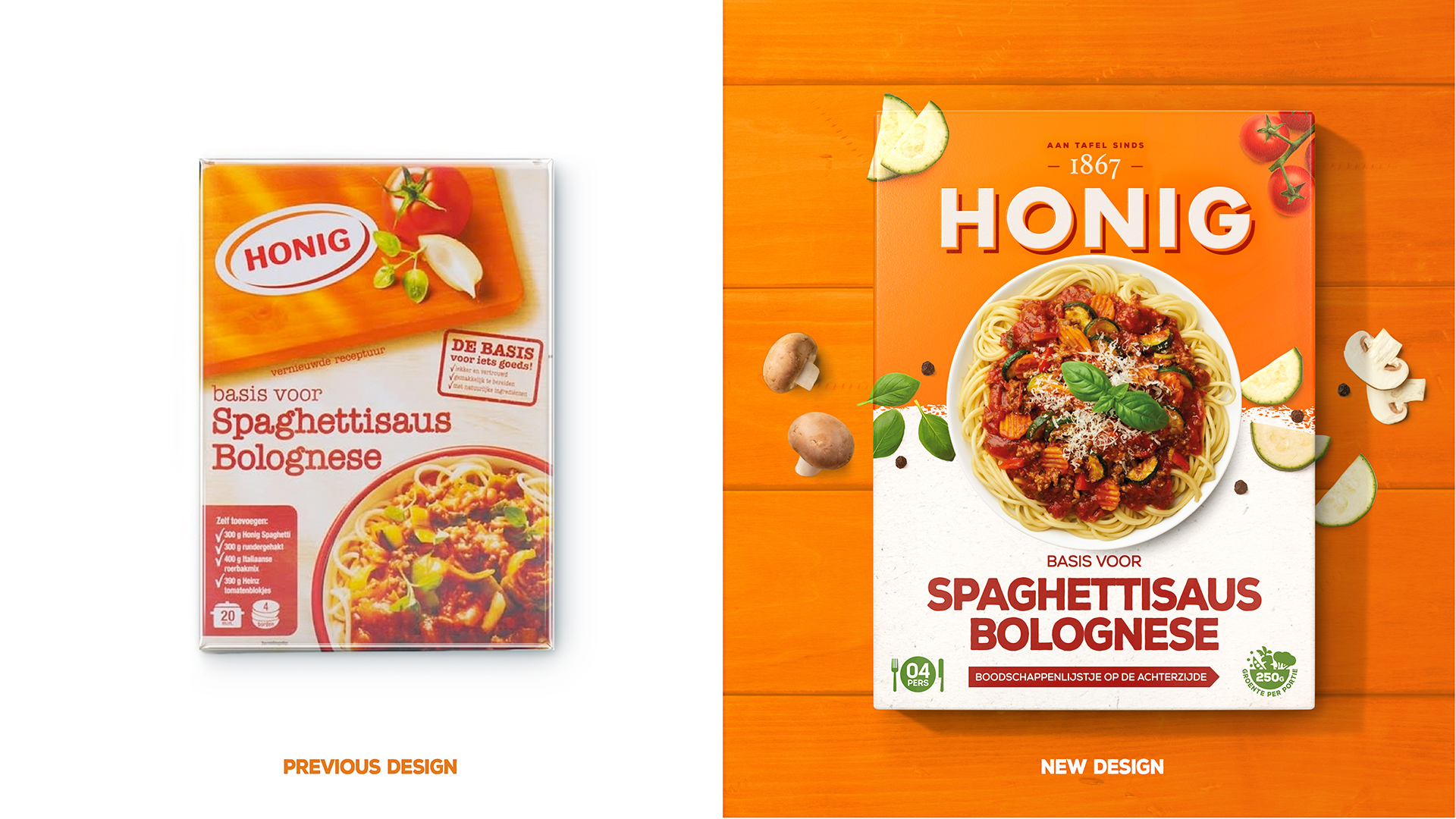
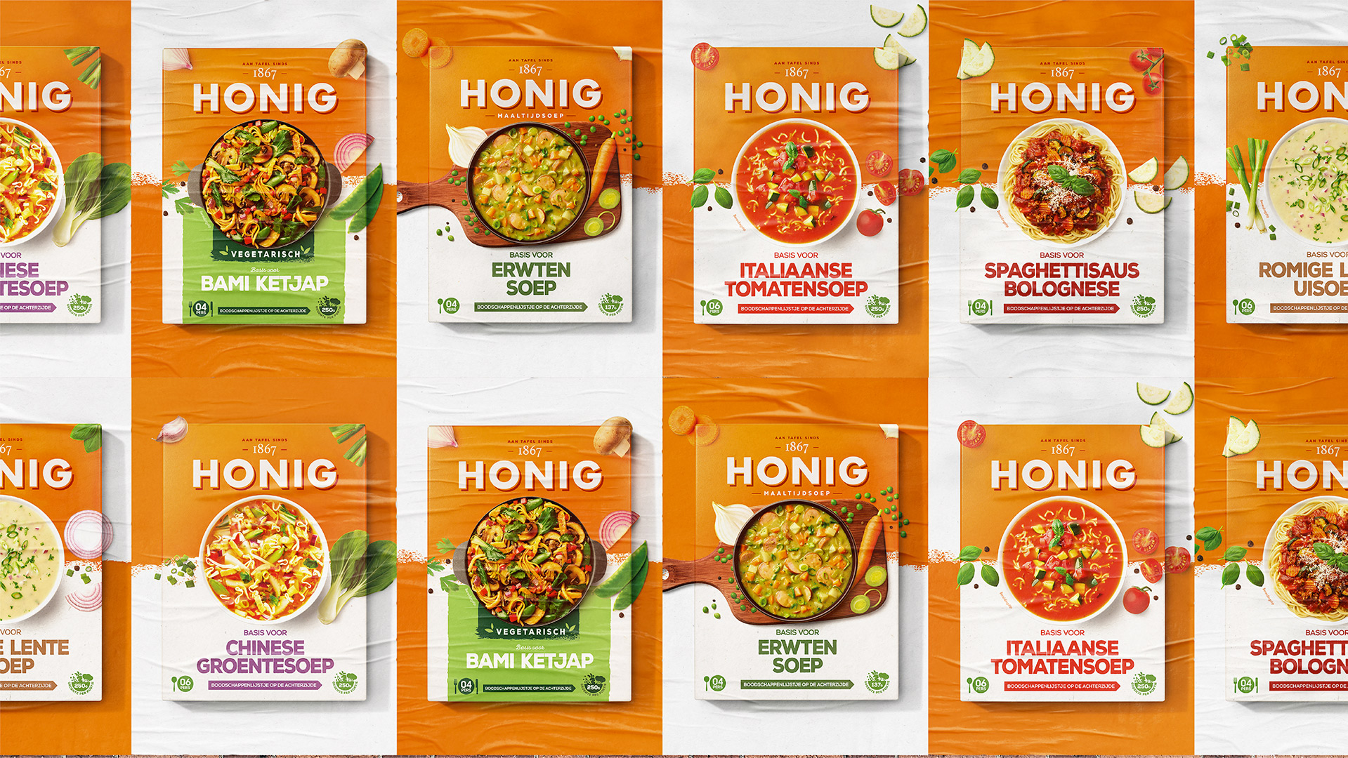
The original brandmark lacked standout and modernity, which in turn compromised brand blocking and recognition at shelf. The new brand mark has broken free from its previous oval constraints, allowing it to sit proudly on the famous Honig orange whilst interacting with the brand elements around it. We’ve further accentuated the brand’s unique and recognisable colour palette to reinforce unified and distinctive brand blocking on shelf.
taste appeal
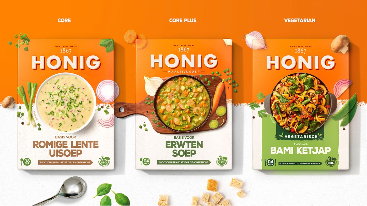
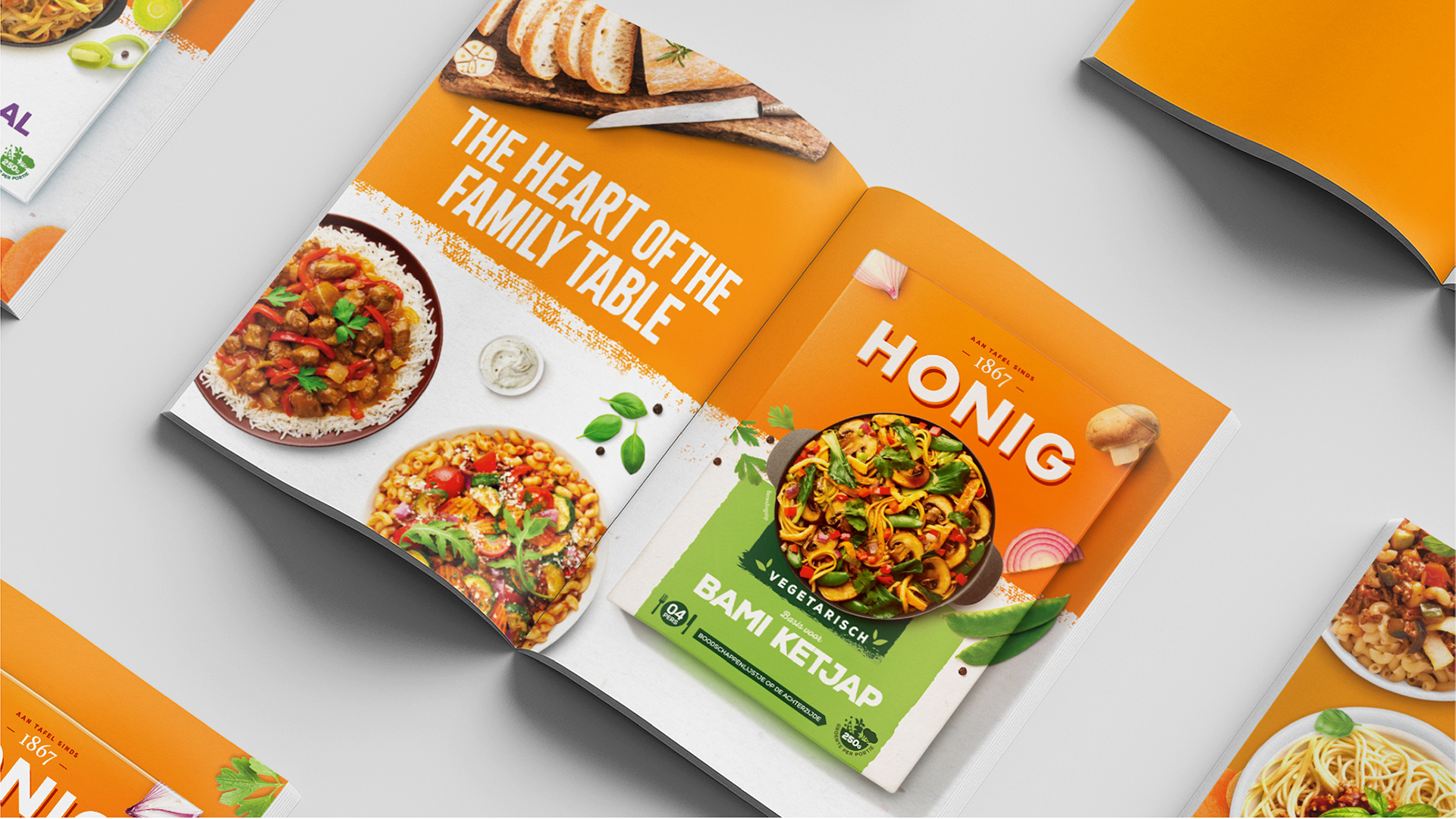
Delivering taste appeal is fundamental to the new visual identity with every mouth-watering dish featured at the very heart of each pack and depicted through delicious food photography. Where the previous design was dated, we have developed a clear, contemporary and flexible hierarchy to allow the brand to grow into new and exciting product ranges in the future.
clarity
An extensive product range and diverse portfolio combined with several minor design changes in recent years, meant consumers found it increasingly difficult to navigate through the different product ranges. Our distinctive and single minded new visual identity delivers clarity and legibility, whilst driving strong brand reappraisal and new consumer appeal.
“It was clear that we needed to create a relevant and compelling brand proposition that re-connected Honig’s past with the consumer trends of today. We’ve progressed the brand from looking dated and apologetic to an exciting and delicious new space. Honig now own’s orange as opposed to simply ‘wearing’ it!”
Lloyd Moffat, Creative Director - PB Creative
The best cardboard packaging designs
Honig
awards & recognition
| Total | Awarding Body | Award Name |
|---|---|---|
|
-1
|
World Brand Design Society | Silver |