turning over a new leaf...
To succeed in the saturated tea market requires brands to have a unique proposition allowing them to stand out on shelf as well as in the hearts and minds of consumers. Premium tea brand Pure Leaf, which embraces traditional practices, sustainability and excellence in flavour, had a strong proposition, but needed a more compelling packaging solution to better connect the brand’s values to its products.
- Client / Pure Leaf
- Work / Brand
- Year / 2019
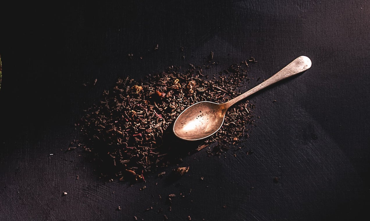
Pure Leaf’s range of single origin and blended teas uses ingredients sourced from top producers all over the world and is made in collaboration with the industry’s most reputable tea masters. The brand goes to great lengths to source its tea in a sustainable and responsible way.
the brand story
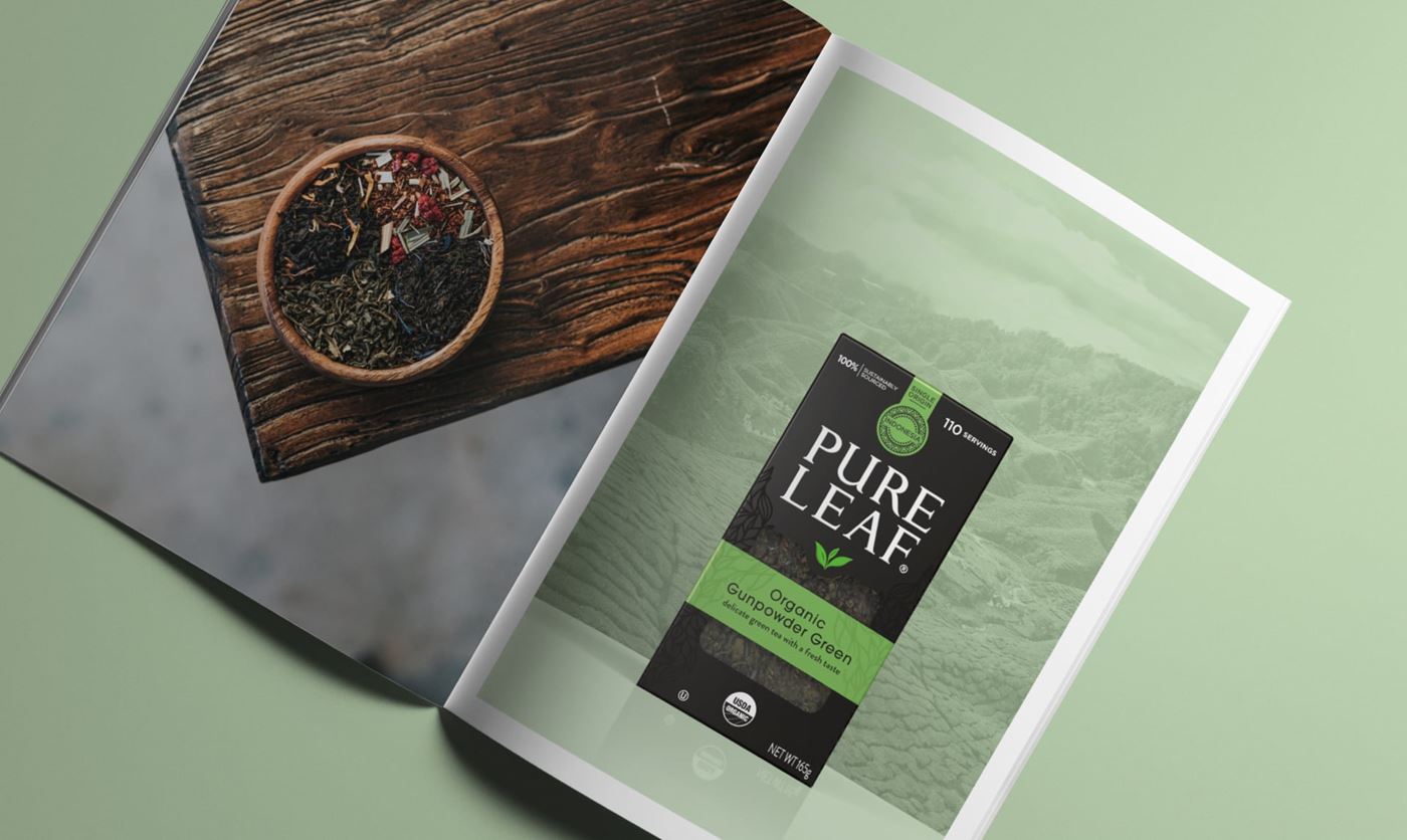
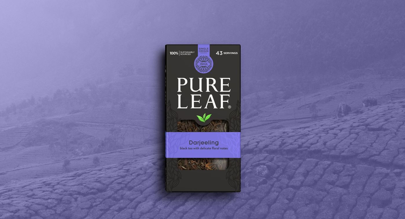
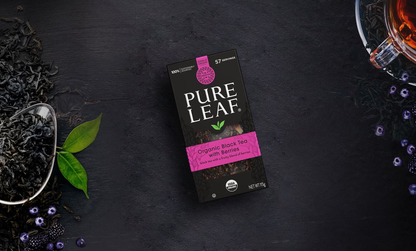
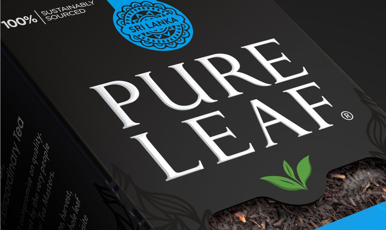
Celebrating the brand’s story of provenance and everyday premium quality was key to refreshing the visual identity and creating distinctive new packaging designs. We felt that Pure Leaf’s distinguishing philosophy and the engaging narrative around its teas’ provenance were difficult to decode in the existing design. We could see a big opportunity to communicate these key brand characteristics clearly to consumers and leverage the brand’s distinctive visual identity with category-defying black packs.
Moving from plastic jars to a more sustainable carton format
One of our first tasks was to move Pure Leaf from plastic jars to a more sustainable carton format – a move that was deemed essential in order to reflect the brand’s sense of environmental responsibility.
We worked with our packaging partners to create a box structure that increased the scope for brand, variant and provenance expression on pack, highlighting the strong taste appeal across all the black, green and herbal teas.


stand-out
stand-out
It was imperative to set Pure Leaf apart from its largely kaleidoscopic competitors.
We capitalised on the original core brand colour – black – which had taken a back seat to variant shades in previous design iterations. This approach instantly unified and premiumised the range and created the opportunity for dramatic brand blocking. Vibrant variant colours were chosen to emphasis individual flavour profiles as well as to create a sense of indulgence and to make it easier for consumers to navigate the whole line up. The black canvas really makes these colours ‘pop’ and imbues the packs with a feeling of luxury and taste appeal.
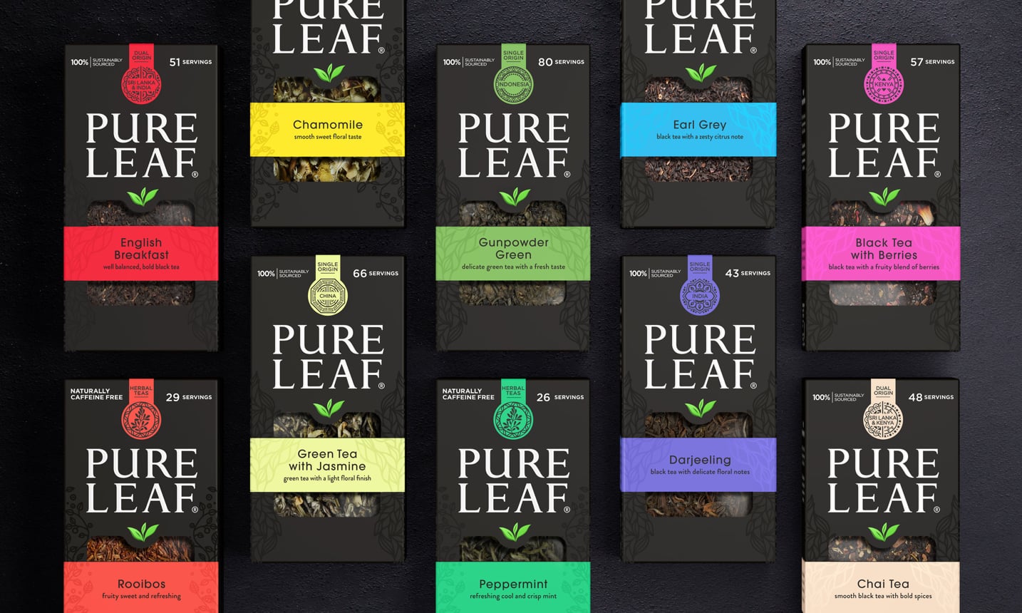
We also used spot-varnish finishes and embossing to further denote tea type and give a high-quality tactile look and feel to the pack. And, to further celebrate the origin of each variant we have designed unique box tags with patterns inspired by each tea’s source, building on the provenance messaging.
"PB Creative has been a breath of fresh air for the Pure Leaf brand & we're glad to have them as our design agency partner."
Javier Martin, Senior Global Marketing Director - Premium Tea Beverage